Unveiling the brand-new face of Triton Contracting!
At the heart of this bold rebrand is a distinctive crane hook illustration, surrounded by eye-catching blue and yellow colors that capture the brand’s strength and reliability. This logo is designed to make a lasting impression across all brand assets, reflecting Triton’s commitment to quality and precision in every project.
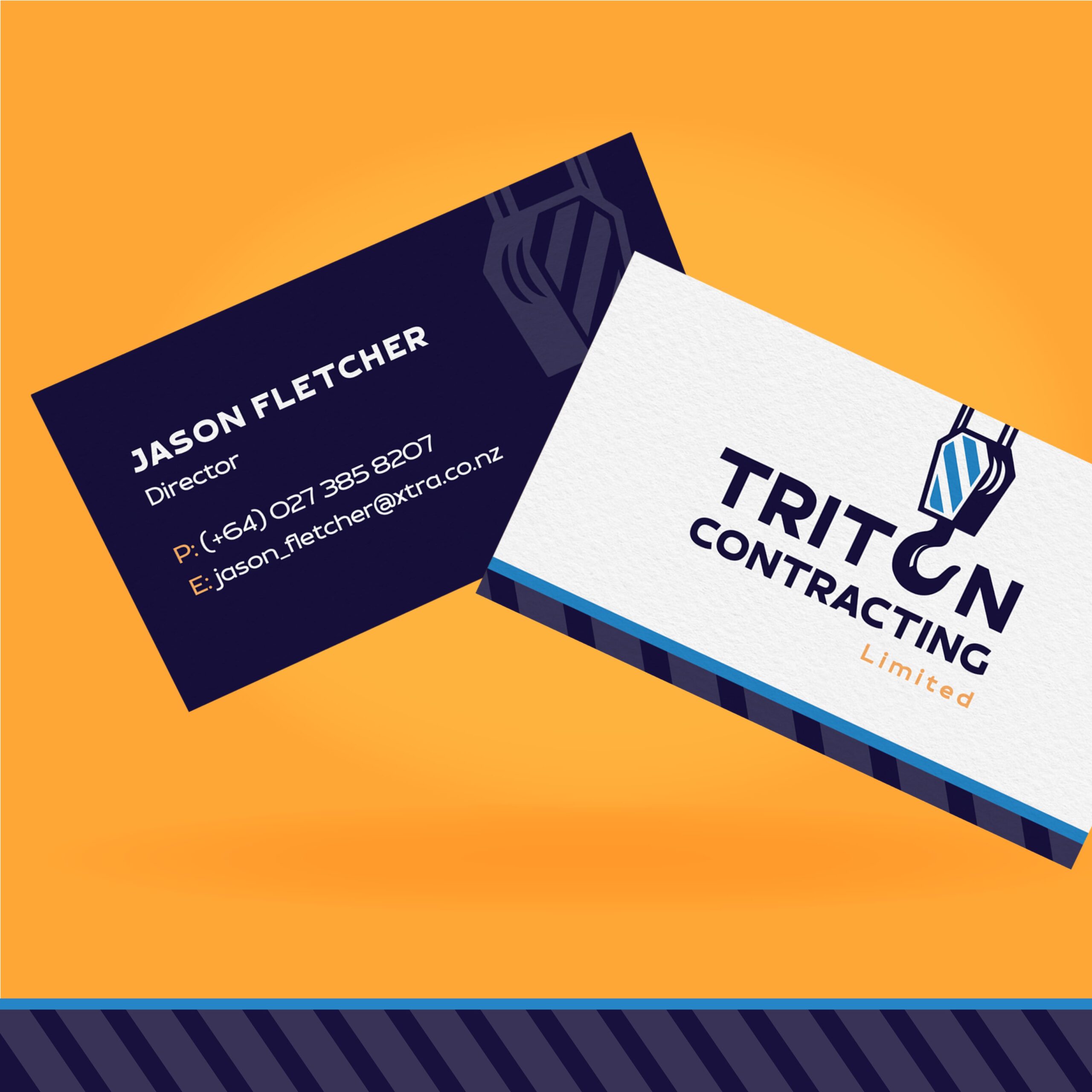
To extend Triton’s brand presence beyond the logo, we crafted sleek business cards featuring a striped brand pattern, inspired by the industrial markings commonly seen on cranes. These cards not only reinforce the brand’s identity but also bring a unique, professional touch to every client interaction.
This refreshed branding package for Triton Contracting blends functionality with visual impact, ensuring the brand stands tall and instantly recognizable.


