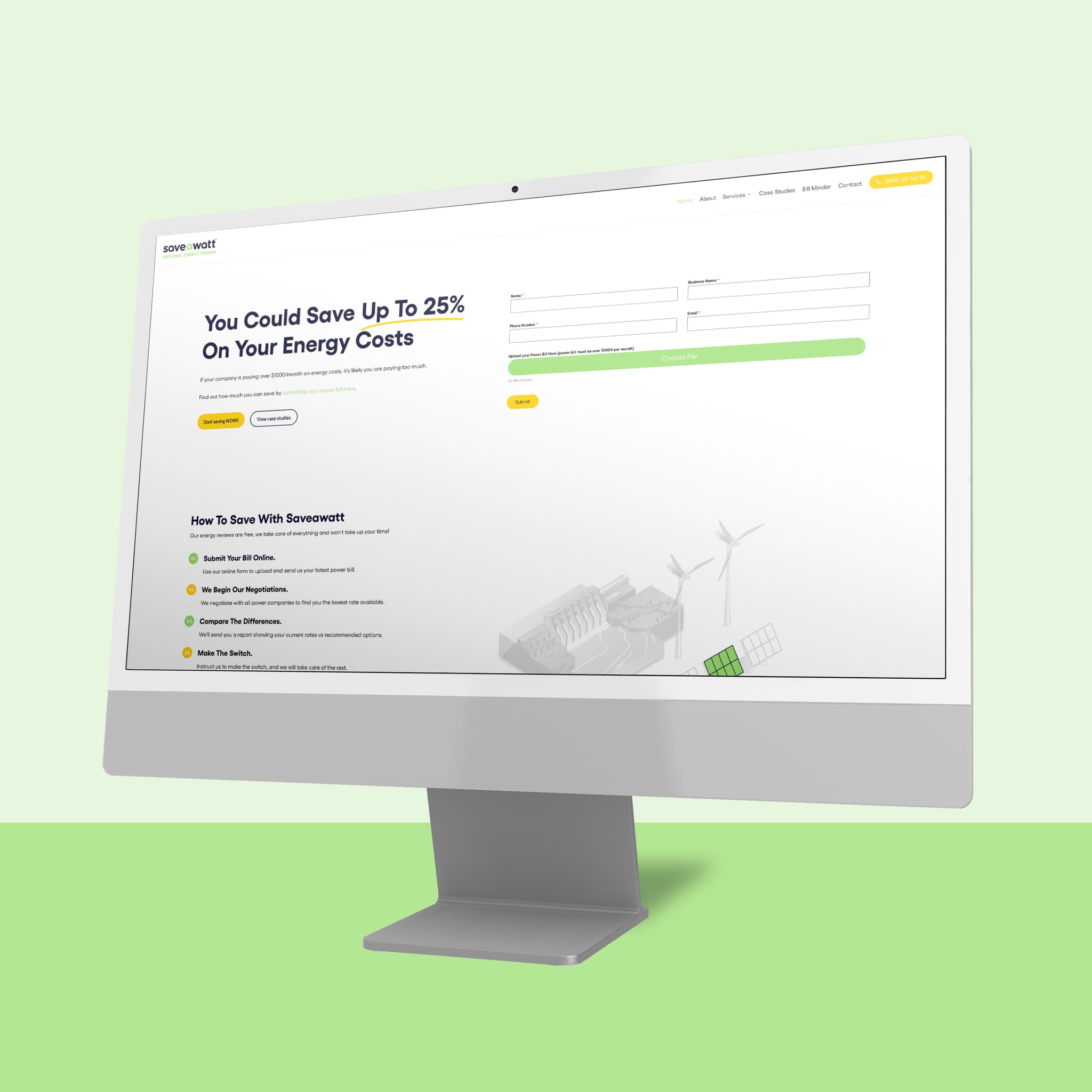
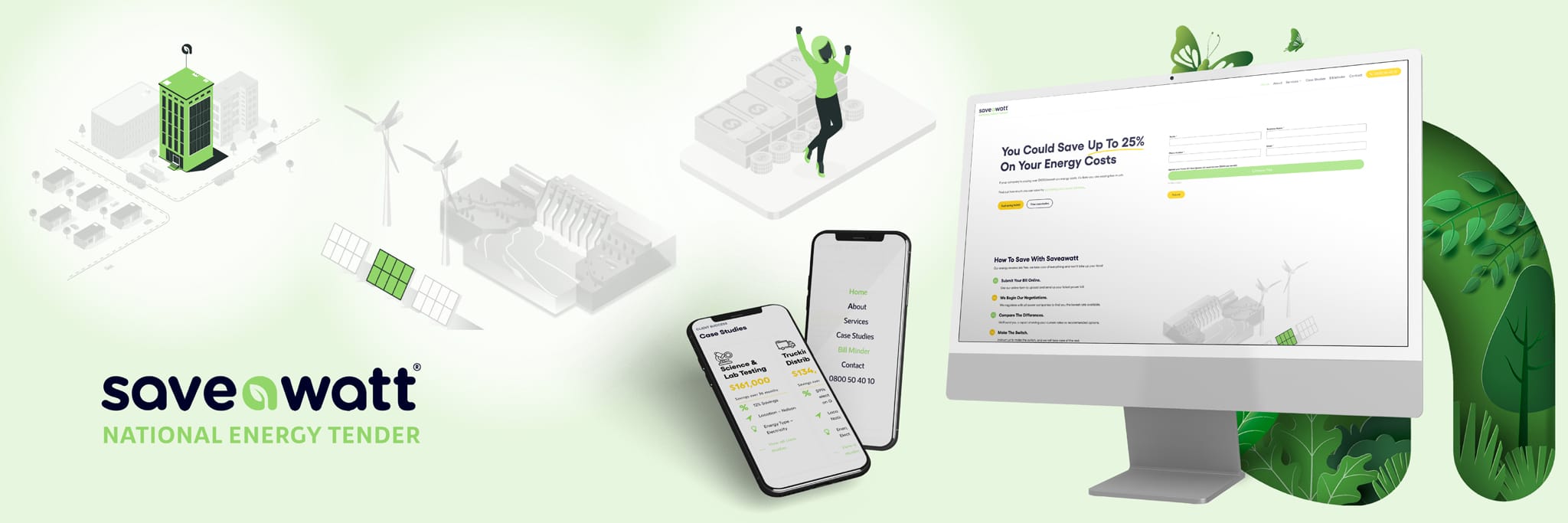
We had a fantastic time developing a refreshed identity for Save A Watt! Starting with their logo, we introduced a green and grey colour scheme and simplified the tagline, giving it a clean, powerful look that reflects their energy-conscious mission. This revamped logo now serves as a strong visual anchor for the brand, providing a modern and professional touch across all materials.
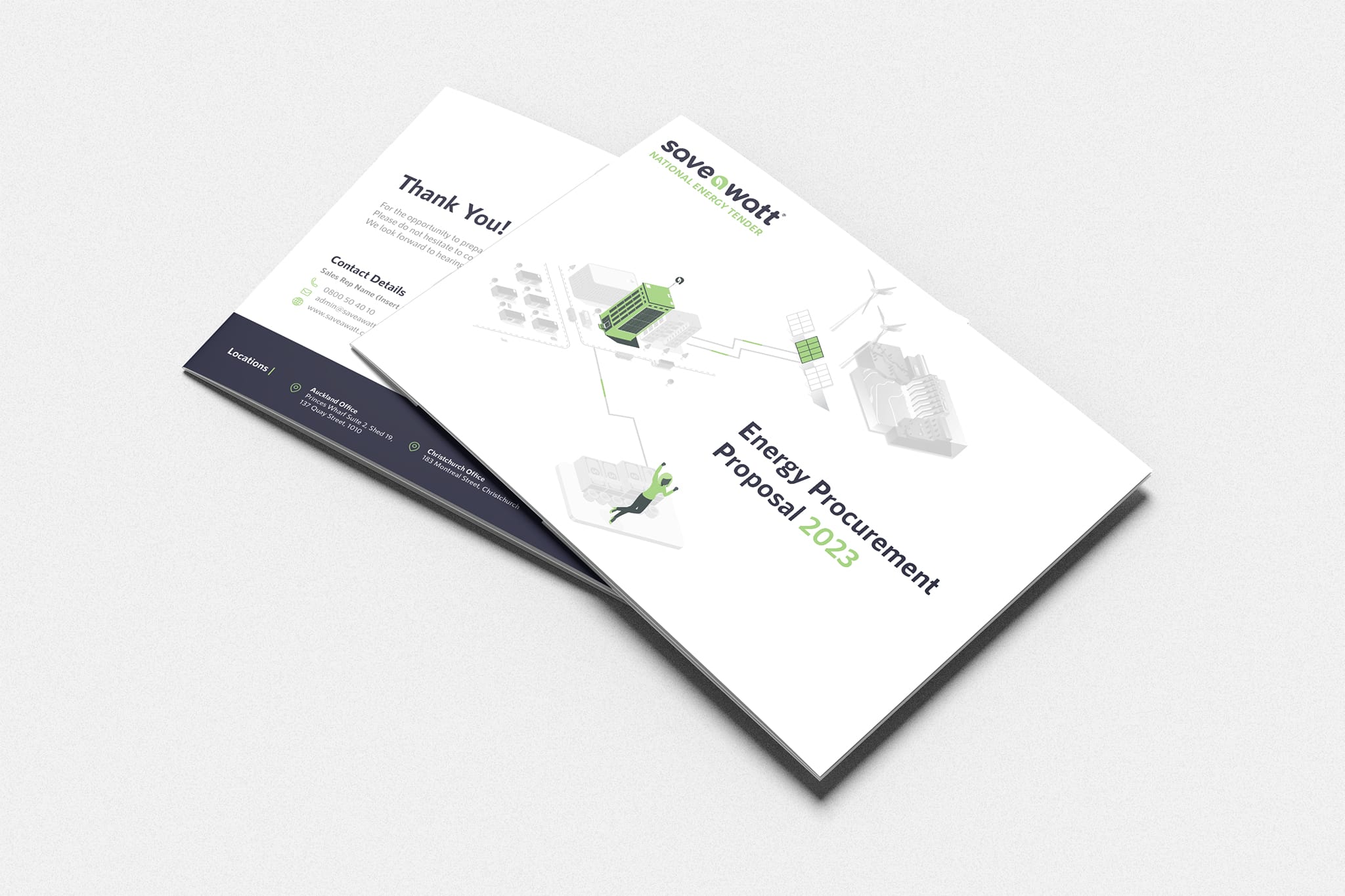
We extended this refresh to their website, crafting a youthful and user-friendly online space that’s both a valuable resource and key brand touchpoint. With secure hosting and an SSL certificate, users can explore Save A Watt’s services confidently, while polished tender documents further reinforce their professionalism. The result is a cohesive brand identity that effectively communicates Save A Watt’s expertise and commitment to sustainability.
Take a look at their new website at www.saveawatt.co.nz


